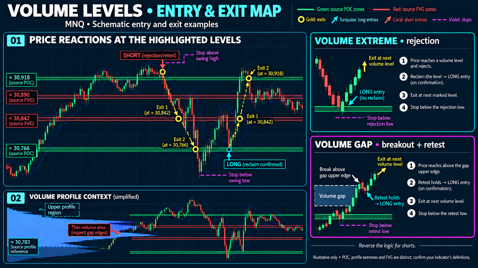
| Structure | On the chart | Typical behaviour |
|---|
| High-volume node / POC | Green band | Attracts price, then holds it. Expect rotation and chop, not clean continuation. |
| Low-volume gap / FVG | Red band | Offers no resistance. Price travels through fast, often in one or two bars. |
| Profile extreme | Where the histogram thins to nothing | The edge of participation. Where excursions end and turn. |
Pattern 1 — the node as a magnet
Watch the upper green band on the chart above. Price crosses it in the early hours, leaves it behind on the run toward 31000, sells off well below it, and then spends the entire back half of the session pinned to it. That is the defining behaviour of a high-volume node: it pulls price back, and once price arrives it stops trending.
The practical read is not “buy the node.” It is that your expectation of the next hour should change when price reaches one. Targets that sit just beyond a node are lower-probability than targets short of it. A breakout initiated into a node is fighting the one structure on the chart designed to absorb it.
Pattern 2 — the gap as a vacuum
Now look at the red band in the lower half of the same chart. When price breaks down through it, it does not grind — it covers the distance in a handful of bars with long-bodied candles and almost no overlap. Nothing was built there on the way up, so there is nothing to lean on during the way down.
This is the structure that punishes a stop placed inside it. A gap is exactly where price is least likely to pause, which makes it the worst available location for an order that depends on price pausing. It is also why a target set on the far side of a gap is often more realistic than one set inside it.
The sequence worth recognising: price accelerates through a gap, decelerates on arrival at a node, and rotates. Gap for travel, node for destination. Once you have seen it a few times, the projected bands tell you which half of that sequence you are currently in.
Pattern 3 — the turn at the extreme
The second chart adds the session volume profile so you can see the shape the bands are derived from. The histogram is fat through the middle and tapers to almost nothing at both ends. Those tapers are the extremes.
The same session with the volume profile overlaid. The bulk of the distribution sits in the middle; the excursions that turned are out at the thin edges.
Both large moves on this chart terminate where the histogram runs out. That is not coincidence — an excursion into thin volume is, by definition, price moving to where participation has stopped. Something has to come in to continue it. When nothing does, the move reverses back toward the middle of the distribution.
The extreme does not tell you the turn is now. It tells you the market has left the area where business gets done, and that continuation from here needs fresh volume rather than momentum.
Reading it in practice
| Question | What the bands tell you |
|---|
| Where do I put the target? | Short of the next node, not past it. A gap between entry and target is a tailwind; a node in the way is a wall. |
| Where does the stop not belong? | Inside a gap. Price moves through that area fastest, so a stop there gets taken on noise rather than on being wrong. |
| Is this breakout worth taking? | Into open space, maybe. Into a node that has already absorbed size today, the odds are against it. |
| Should I expect trend or chop? | Sitting on a node means rotation. Between levels with a gap ahead means the move can extend. |
The bands are projected forward, not drawn after the fact. That is the entire point — a level that appears once price has already reacted to it is a description, not a plan.
Notes on setup
The charts here run on MNQ at 3 minutes, alongside a Keltner channel and RSI. The indicator itself does not depend on those — they are there to show that the bands read the same way whatever else you have loaded. Lookback and sensitivity are exposed as parameters so the band count can be tuned to your instrument; too many levels is as unhelpful as none.
Everything runs locally inside NinjaTrader 8. No cloud service, no external data dependency.
See the levels before price gets there.
Volume Profile Extremes projects high-volume nodes and volume gaps forward on any NinjaTrader 8 chart.
Explore Quantellics Indicators
Educational content only. Nothing here is trading, investment or financial advice, and nothing here is a recommendation to enter any particular trade. The charts shown are historical examples selected to illustrate chart structure; they are not representative of typical results and no claim is made about future performance. Futures trading carries substantial risk of loss and is not suitable for every investor. Past performance is not indicative of future results. Quantellics is an independent NinjaTrader Ecosystem vendor. Chart images © NinjaTrader, LLC.